• Our Work
  • Industries
  • About
  • Get In Touch

Penn Foster

Making wayfinding way easier
pennfoster.edu

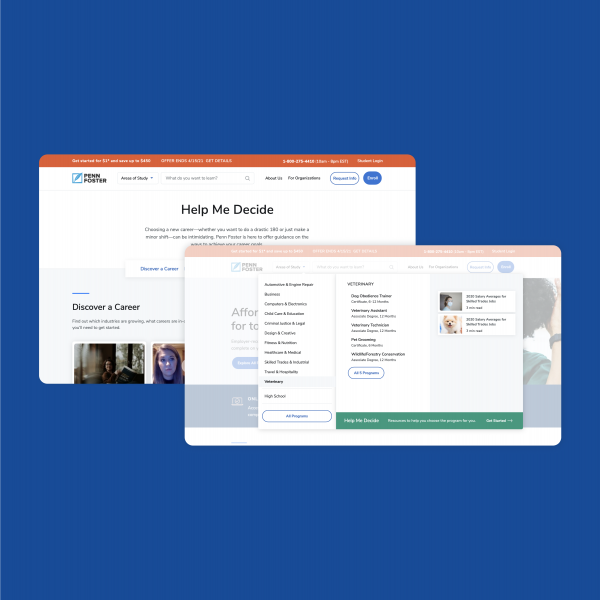
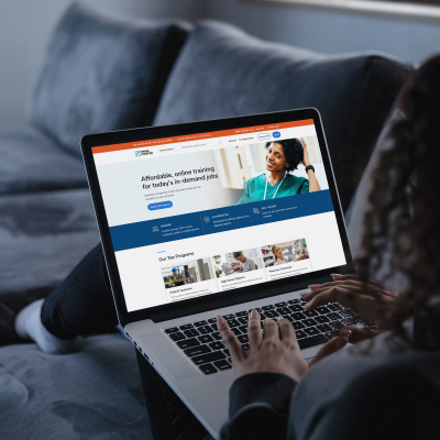
By providing contextual support, we made it easier for learners to choose a career path.

  • Personas

    Bringing your target users to life with personas that are rooted in research and crafted with strategic data and insights creates a clear voice to model.

  • Journey Maps

    The path of an experience is seldom a straight one, especially when looking to improve your user experience. Mapping that journey is a powerful way to begin.

  • Accessibility Audits

    We make accessibility easy — from the early stages of design through final development, we ensure the latest compliance standards are always top of mind.

  • Experience Strategy

    We evaluate internal perceptions, user goals and best practices to find that “special sauce” that drives an actionable roadmap for your future experience.

  • Sketches

    When it comes to bringing ideas to life, the pencil is mightier than the keyboard. And much faster.

  • Prototypes

    If a picture is a thousand words, a high-fidelity prototype is the entire story. Bringing the user experience to life with a fully-interactive artifact is a low-cost, high-value way to iterate without the investment of code.

  • Responsive Design

    We design for the future on today’s devices. Every element is considered for every size display to create an ideal experience for all users.

  • Visual Design

    Through imagery, messaging, color and typography, we deliberate over pixels, consistency, readability, contrast, accessibility and creativity.

  • User Testing

    To get decisive, actionable findings, we let users explore without artificial restrictions. We design our prototypes to accommodate this need, as a final product would.

  • Functional Specifications

    Converting your designs into well-documented specifications with functionality, flows, layout, and styles ensures that no developer has to guess what comes next.
The Challenge

PennFoster offers self-paced, career-relevant programs that meet learners where they are. But finding a way to organize so much content—making it both discoverable and navigable—can be quite a challenge. 

Some learners know exactly what they need. Others may not know where to start. Between internal business initiatives and interests driving the site, the need to break out of traditional department labeling, and the expansive catalog PennFoster offered—we needed to figure out how to make the complex clear, for everyone.

Newly designed product page that helped make choosing a career path compelling and efficient

Our Approach

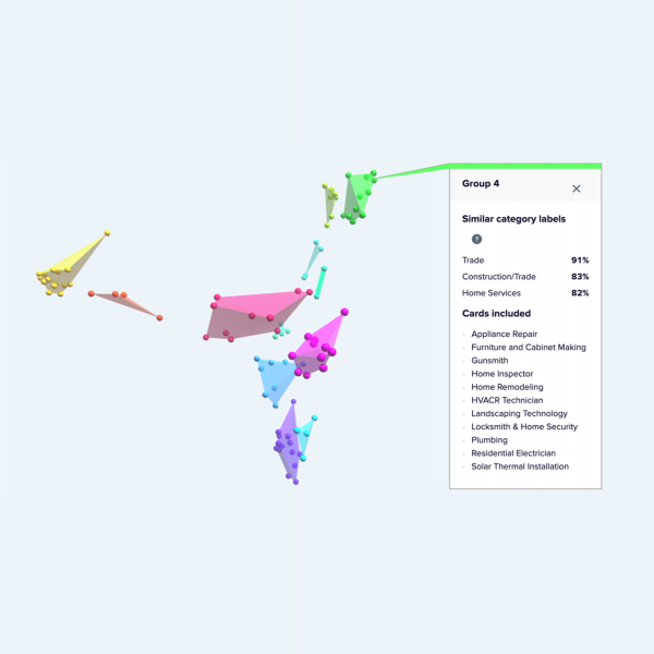
Our first priority was to bring structure to decision-making. We went deep with user research. Open card sorting. Closed card sorting. Tree studies. It all gave us valuable data-driven insights to guide the team in creating an ideal taxonomy.

We pulled out the whiteboard and gathered around the digital roundtable for a series of interactive online workshops to align key internal stakeholders. We talked to customers and prospects to get feedback as ideas came to life. During it all, the user’s voice became a valuable tool to guide key business decisions.

Taxonomy study with broad base of users to identify the most intuitive categorization for all programs

The Solution

Through the input sessions, we uncovered new ways to present information to different people. Providing career outcomes and employment data at every step of the process helped guide career-minded learners. Finding new ways to group programs—“In-demand skills” or “Work from home”—aided students who didn’t necessarily know what they wanted to study, while still allowing for easy access to more traditional career categories.

Restructured navigation with new user-driven taxonomy and integrated tools to help guide users to their program

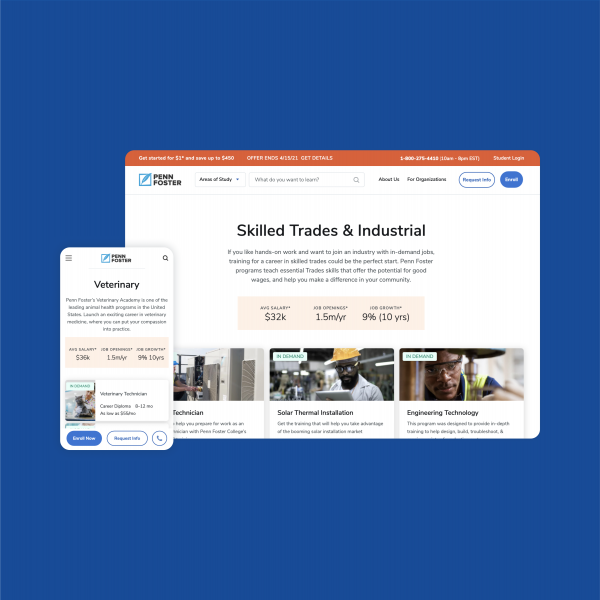
We also created hub pages based on area of study, which used salary, hiring, and job growth data to inform students on career outcomes and promote the relevant programs to help them get there. All while ensuring that high-value content (program price, format, accreditation information) was easy to scan and deep-dive curriculum information was easy to access. 

Through it all, ZeroDegrees partnered closely with PennFoster’s in-house design team. During our web work, they were creating a complete rebrand for the organization. And making sure our output reflected theirs was key to the success of both.

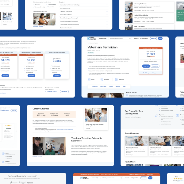
A clear and well-organized program page that presents content based on user needs derived in research

The Results

We’ve seen improvement on the metrics that matter: more visitors converting to prospects.

Enrollment Conversion Rate

4%

Visitors Getting to Program Pages

Up

Engagement with Program Details

Up

Alignment of Prospects with Selected Programs

Up

ZeroDegrees reinvented the way we engage users with our brand

It was clear we needed structure and user data to help us make decisions, and ZeroDegrees delivered the right amount of info and recommendations at just the right time. Overall, all of our site data points to the navigation being much more effective—we’re getting people to the right pages, which has been terrific for lead conversion.

Brittany White, Sr. Director, Website Experience, Penn Foster

Reimagining higher ed experiences in an age of intense ROI pressure.

Our Thoughts on Higher Education

Previous Blueshift Platform Design

Next OwnUp Mortgage Shopping

© 2025 ZeroDegrees, Inc.

  • Policies

LinkedIn Visit us on LinkedIn